Please note: A Button Grid Container is not a standard container across all the sites we build. They are implemented if the website design and/or functionality requires them.
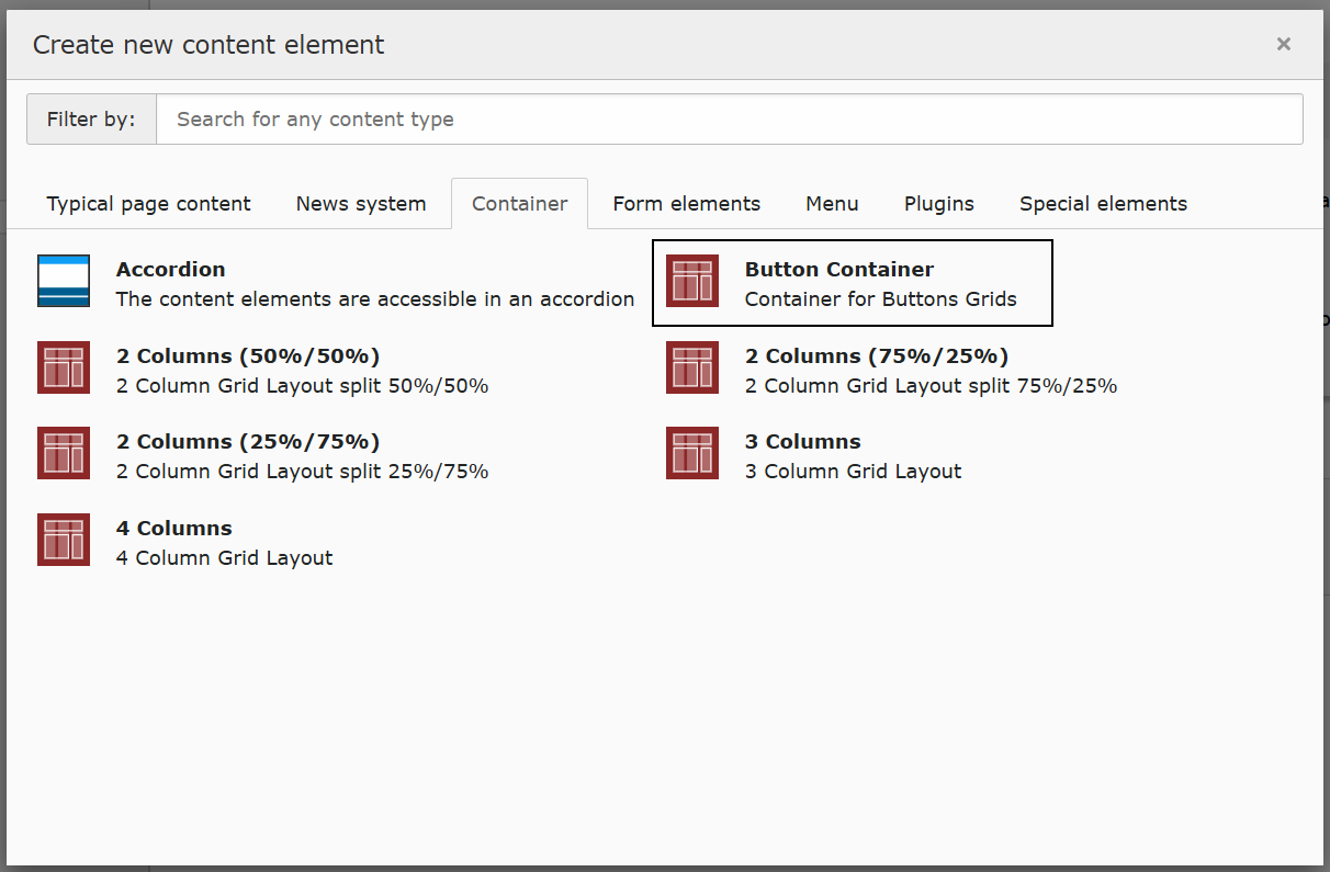
Creating a Button Grid using the Button Container
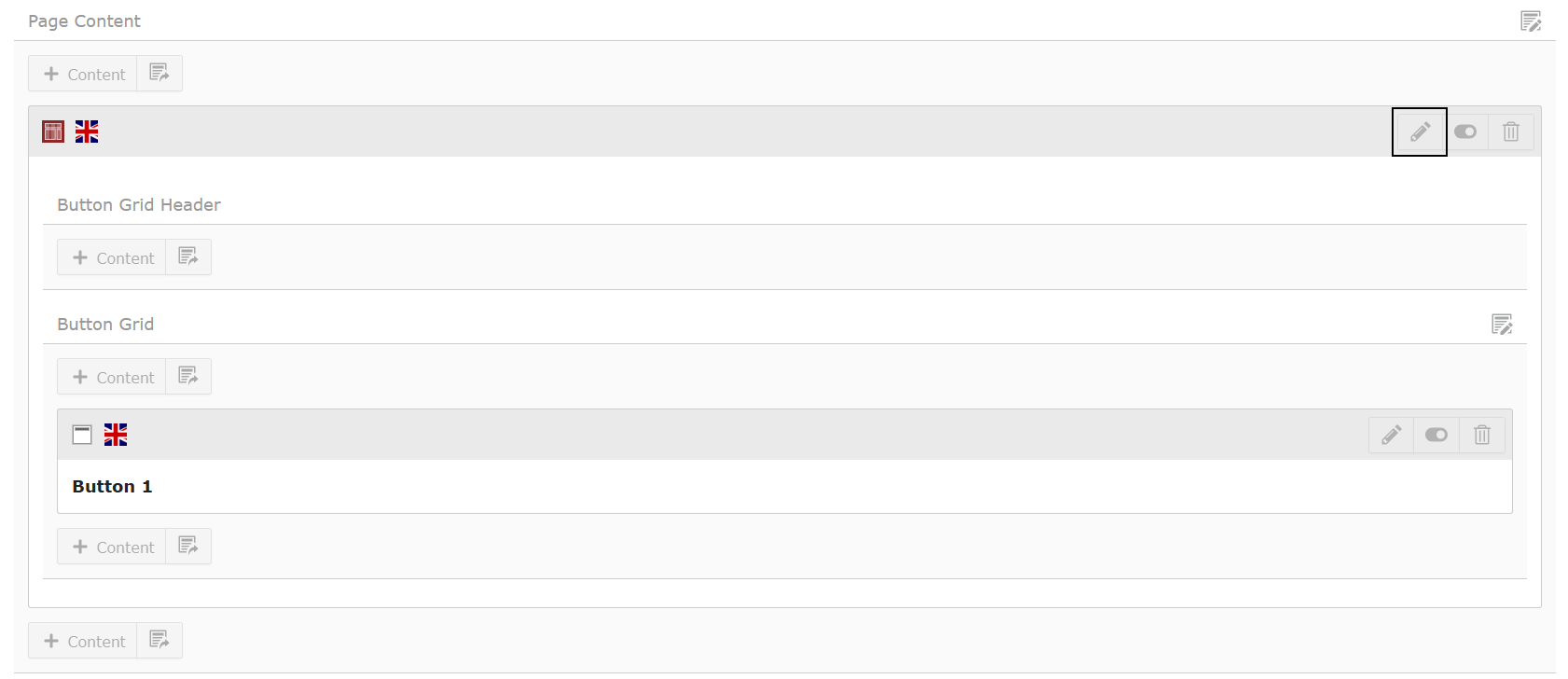
In some cases, we implement Button Grids through a custom Button Container. This will appear as a content element under the Container tab.
Please note: If you do not see the Button Container, it may be restricted to a specific page layout such as Page with Button Grid on your site. If you wish to use this element, you will need to update your page layout before contuining. See Changing page layouts for further guidance.
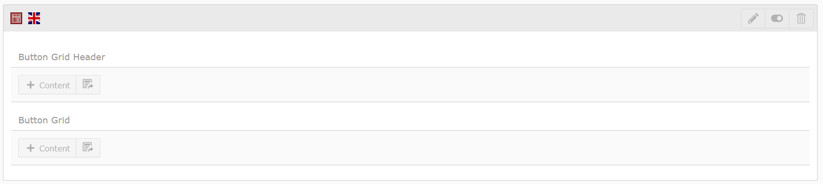
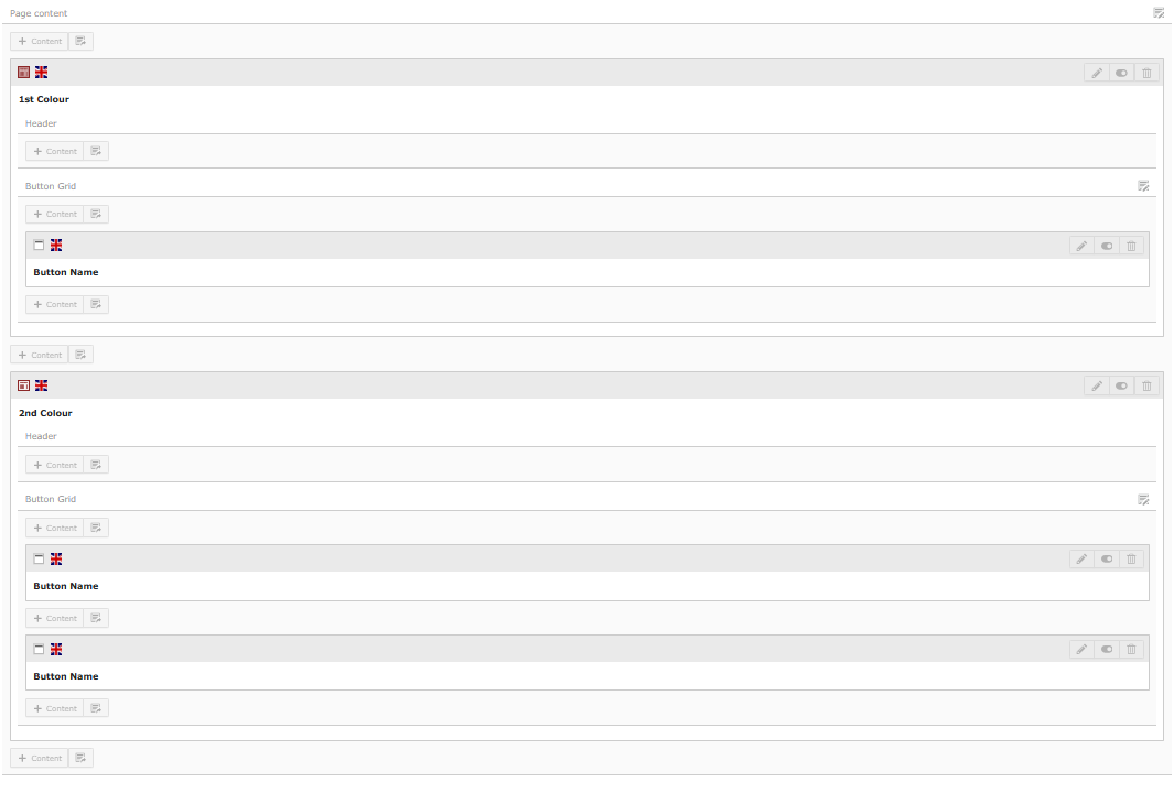
When the Button Container is added to the page, you will see 2 areas for content:
- Button Grid Header = This is optional and allows you place a Header Only, Regular Text Element or Text & Images content elements inside to introduce the Button Grid if needed.
- Button Grid = This is where you will add Header Only content elements to create the buttons.
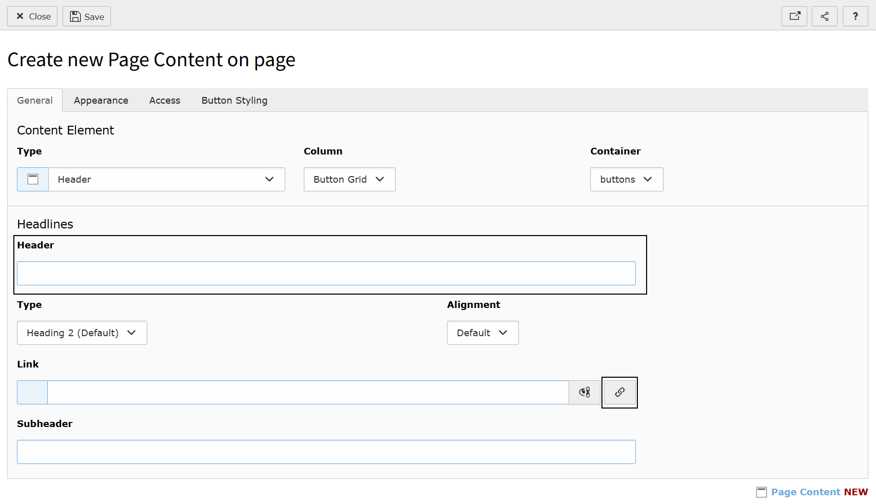
In the Button Grid area, you can add or amend the Header Only content elements which are the individual buttons in the grid.
While in the General tab, make sure you have filled out the Header and Link field. The Header will be the name of the button.
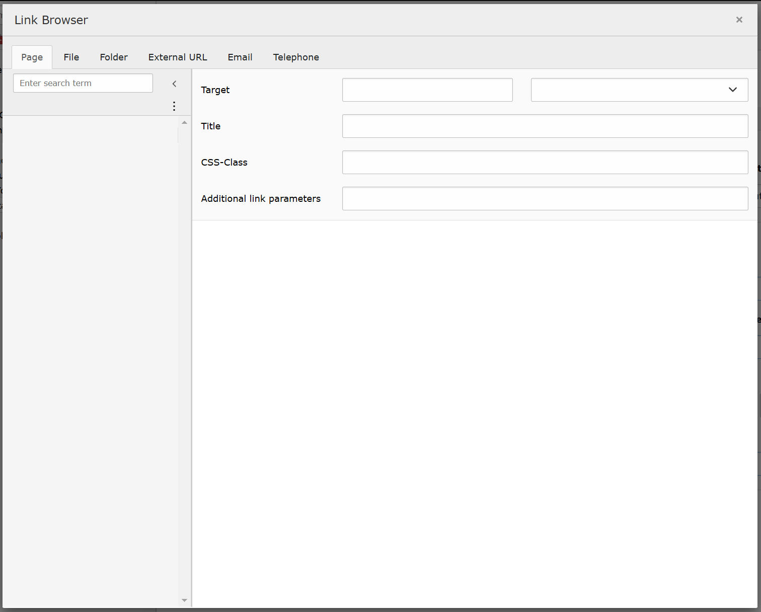
Clicking the Link icon, you can use the Link Browser to either link to a:
- Page
- File
- External web address
- Telephone number
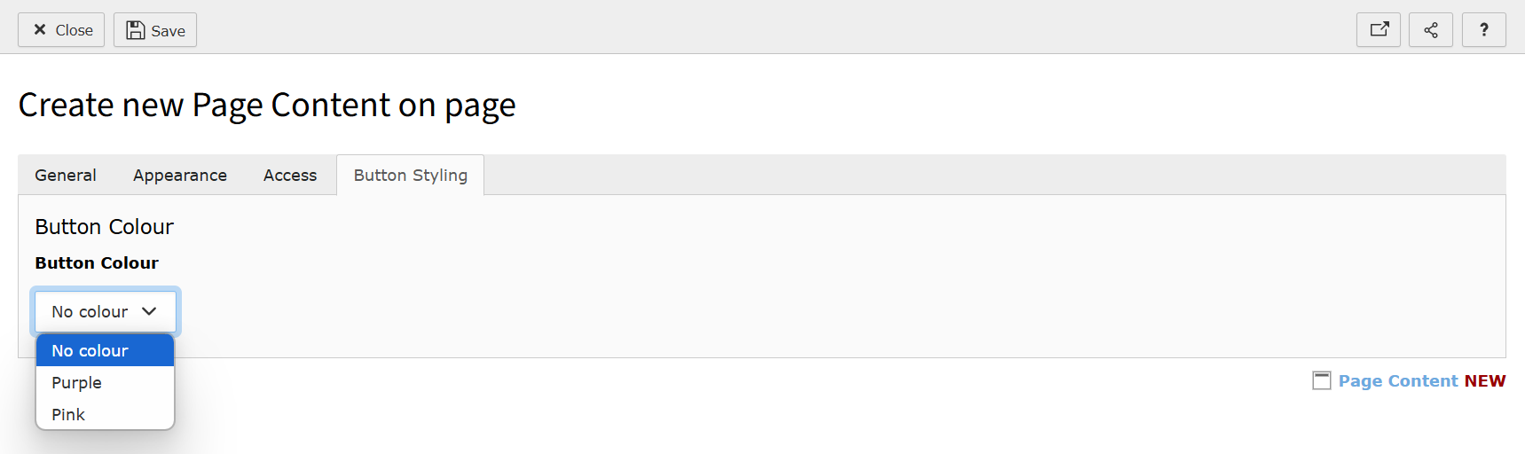
Setting the button colour
Within this Header Only content element, as it has been created inside the Button Container, you will see a custom tab called 'Button Styling'.
Inside this tab, there is a dropdown allowing you to choose the colour you'd like that individual button to be. Select the colour from the dropdown list.
Please note: If you do not see the Button Styling tab, your website will use Frames to apply the button colour. Frames are found under the Appearance tab.
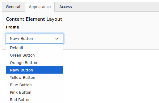
You must select either a Button Colour from the Button Styling tab or a Button Frame from the Appearance tab in order for the links to have the appearance of a button depending on which setup your site uses.
Click Save and then click Close.
You can add as many buttons (Header Only content elements) into the Button Grid area. These can be re-ordered too by dragging and dropping the individual content elements.
Grouping sets of colours
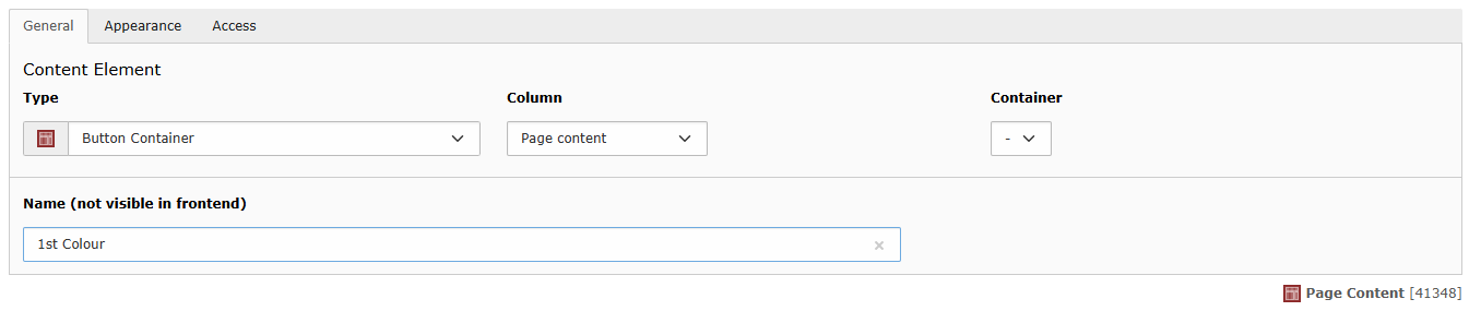
If you wish to group buttons into colour sets, you will need to create separate Button Containers. One for each colour set.
You can edit the Container to provide a Name which appear only appears instead TYPO3, for example 1st Colour. This can help you keep a track of how many colour sets you have.
If you want the colour sets to appear vertically rather than horizontally, as is the default, you will need to place the Button Container instead a 4 Column Container.
Adding tooltips to your buttons
Depending on the site you are using this on, the Subheader field can be used to set a tooltip. This appears when the user hovers over the button and provides additional context.
Note: Tooltips cannot be seen on mobile devices or to those who use keyboard-only to navigate the site. This should only be use for supplementary, non-essential information.
Automatically order your Button Grid in alphabetical order
You can order the buttons in the Button Grid automatically in alphabetical order. To do this, edit the Button Container.
Go into the custom tab called 'A-Z Ordering'. Here you will be able to 'Enable A-Z Ordering' on that particular Button Grid. This can be enabled or disabled at any time.
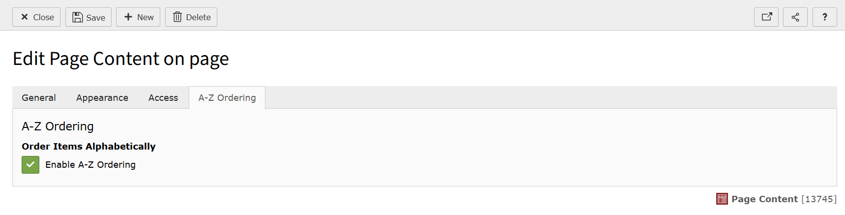
Click Save. Then click Close.